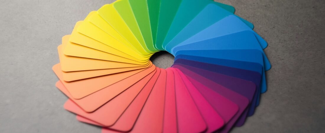
Color is more than a visual experience—it’s an emotional language. Every hue tells a story, evokes feelings, and shapes perception. Artists and designers throughout history have used color to communicate without words, guiding the viewer’s emotions through strategic choices in tone and contrast.
Understanding the psychology of colors in art allows creators to connect more deeply with audiences. Whether it’s the warmth of red or the tranquility of blue, color remains one of the most powerful storytelling tools in both traditional and digital art.
To explore how color evolved in visual expression, visit our feature on the Evolution of Digital Art: From Pixels to AI.
Historical Use of Color Psychology
Long before the term color psychology existed, artists and cultures used color to symbolize emotion, power, and meaning.
- Ancient Egypt: Blue represented protection and divinity; green symbolized fertility and rebirth.
- Renaissance: Artists like Leonardo da Vinci used muted tones to create balance and realism.
- Romanticism: Rich, emotional palettes emphasized passion and the sublime in nature.
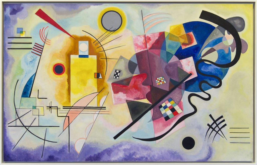
- Modernism: Artists such as Wassily Kandinsky pioneered the study of how color directly affects the human psyche.
Kandinsky believed that “color is a power which directly influences the soul.” His abstract works linked hues to music and emotion—an idea that still influences artists today.
For a broader understanding of how these movements shaped creative expression, explore 10 Inspiring Traditional Artists You Should Know.
Primary Colors and Emotions
Primary colors—red, blue, and yellow—are the foundation of the visual language. Each conveys specific emotions that artists and designers use intentionally.
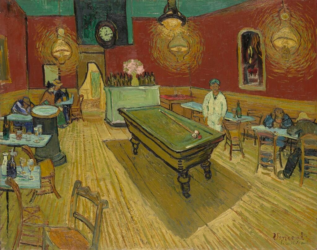
Red – Passion & Energy
Psychology: Red commands attention. It symbolizes love, excitement, power, and danger. It stimulates energy and movement, often used to evoke emotional intensity.
In Art:
- Van Gogh’s The Night Café uses dark reds to express emotional chaos.
- Henri Matisse’s The Red Room transforms a domestic scene into vibrant harmony.
In Design:
Red is powerful in branding and calls to action. It creates urgency, appetite, or intensity depending on tone and context.
Blue – Calm & Trust
Psychology: Blue embodies calm, reliability, and contemplation. It lowers heart rate and fosters feelings of peace and focus.
In Art:
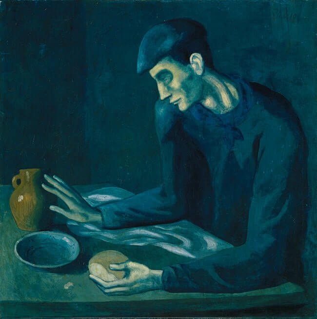
- Picasso’s Blue Period uses cold tones to express melancholy and compassion.
- Hokusai’s The Great Wave off Kanagawa captures the serenity and power of the sea.
In Design:
Blue promotes trust and stability—ideal for brands or artworks that convey clarity and professionalism.
Yellow – Joy & Creativity for psychology of colors in art
Psychology: Yellow radiates happiness and creativity. It stimulates intellect and imagination, but excessive brightness can overwhelm.
In Art:
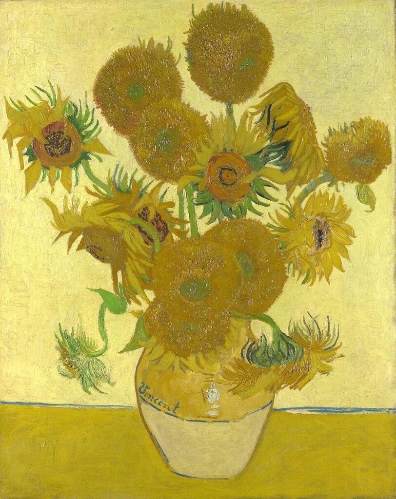
- Van Gogh’s Sunflowers symbolizes hope and vitality.
- Gustav Klimt’s golden tones convey luxury and sensuality.
In Design:
Yellow energizes and highlights optimism—perfect for innovative, forward-looking visuals.
Secondary Colors and Symbolism
Secondary colors—green, orange, and purple—add complexity and nuance, helping artists create emotional depth.
- Green – Growth & Harmony: Reflects renewal, balance, and connection to nature. Monet’s landscapes masterfully use greens to evoke peace.
- Orange – Energy & Vitality: Combines red’s excitement with yellow’s optimism, symbolizing warmth and enthusiasm.
- Purple – Royalty & Mystery: Associated with spirituality and luxury. Georgia O’Keeffe used purples to explore sensuality and the subconscious.
Color Combinations in Modern Art
In modern and digital art, colors work in psychological harmony to create meaning beyond the surface.
1. Complementary Colors
Opposites on the color wheel (like blue-orange or red-green) create striking contrast and tension.
2. Analogous Colors
Neighboring hues (such as blue-green-teal) offer unity and calm—perfect for nature-inspired works.
3. Monochromatic Palettes
Varying shades of one hue evoke minimalism and focus, allowing viewers to concentrate on form and mood.
4. Triadic Colors
Combining three evenly spaced colors (red-yellow-blue) achieves vibrant balance and visual interest.
💡 Example: Digital artists often use warm–cool contrasts to guide viewer emotion, while web designers apply blue backgrounds with red accents to draw user attention.
For professional color systems and trends, refer to Pantone’s Color Resources or explore research on creative emotion in Art Therapy Journals.
To understand how modern styles influence these combinations, see our article on the Evolution of Digital Art: From Pixels to AI.
Conclusion of Psychology Of Colors In Art
Color is more than visual—it’s psychological. The psychology of colors in art reveals how artists can move audiences, evoke emotion, and tell powerful stories through hue and tone.
Whether you’re experimenting with traditional painting or digital illustration, use color deliberately. Let red ignite passion, blue inspire trust, and yellow spark imagination.
🎨 Discover more color theory and art inspiration on Vexaz Art, and dive deeper into your creative journey with guides like 10 Inspiring Traditional Artists You Should Know and 25 Easy Painting Ideas to Spark Your Creativity.